Weekly Market Outlook – That’s the Worst Way to Rekindle a Downtrend (Although It Is a Way)

For a short while last week it looked like stocks might finally snap their losing streak. Then Friday came, up-ending the effort. The best thing about that day’s session (for the bulls) is that it was so harshly bearish the stage is now set for a bounce. On the flipside, so much damage was done last week that it remains to be seen if any dead-cat bounce will actually jumpstart a long-lived recovery rally. Traders may figure the headlines are so ugly, stocks are still so overbought, and we’re so close to the September swoon anyway that they may not even bother plowing back in just yet.
We’ll look at the complicated matter in some detail in a moment. Let’s first look at last week’s biggest economic news and then preview what’s due this week.
Economic Data Analysis
Obviously July’s jobs report is the 800 pound gorilla in the room, but let’s look at all the numbers in order of appearance.
The party started on Tuesday, with May’s home-price data. The Case-Shiller Index grew again year over year, albeit it a slower (but still impressive) pace. The FHFA Home Price Index, however, seems to be leveling off. This is an unusual and concerning disparity, but there may be an explanation. That is, the Case-Shiller Index considers higher-end homes in large cities. The FHFA’s data considers houses everywhere, including in rural areas where cooler price may actually make more sense.
Home Price Index Charts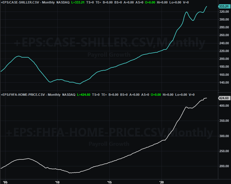
Source: FHFA, Standard & Poor’s, TradeStation
As a reminder, these numbers only reflect the price of homes that are sold. Fewer homes are selling though, so there’s a case to be made that the real estate market isn’t quite as strong as the chart above suggests.
On Wednesday we heard the Institute of Supply Management’s assessment of the nation’s manufacturing activity. June’s figure was revised to a number above 50, but July’s figure of 49.6 drags it back below the make-or-break mark. Even so, the bigger trend is largely bullish.
ISM Index Charts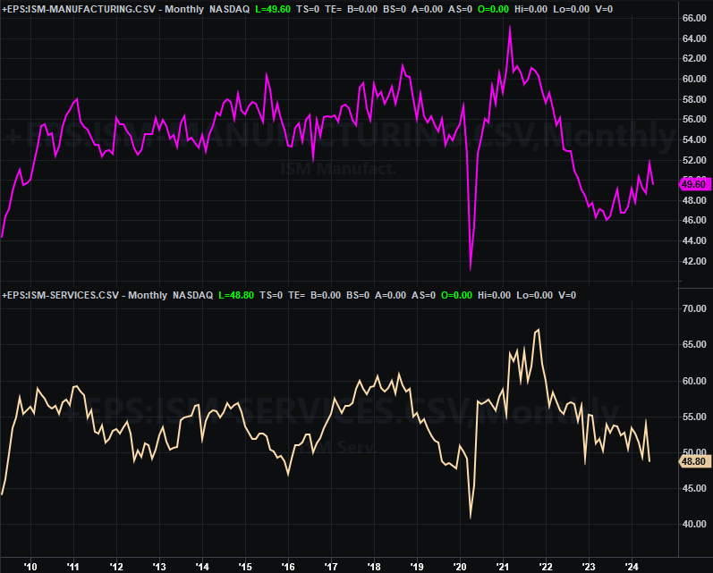
Source: Institute of Supply Management, TradeStation
The ISM Services trend, conversely, remains to the downside. We’ll get an updated number here on Monday of this week.
As for jobs, there are a lot fewer of them being added now. The United States only saw modest payroll growth of 114,000 last month, down from June’s 179,000, and well below estimates of 185,000. That pushed the unemployment rate up to a multi-year high of 4.3%. That’s still not bad, but it’s clearly moving in the wrong direction.
Unemployment Rate, Payroll Growth Charts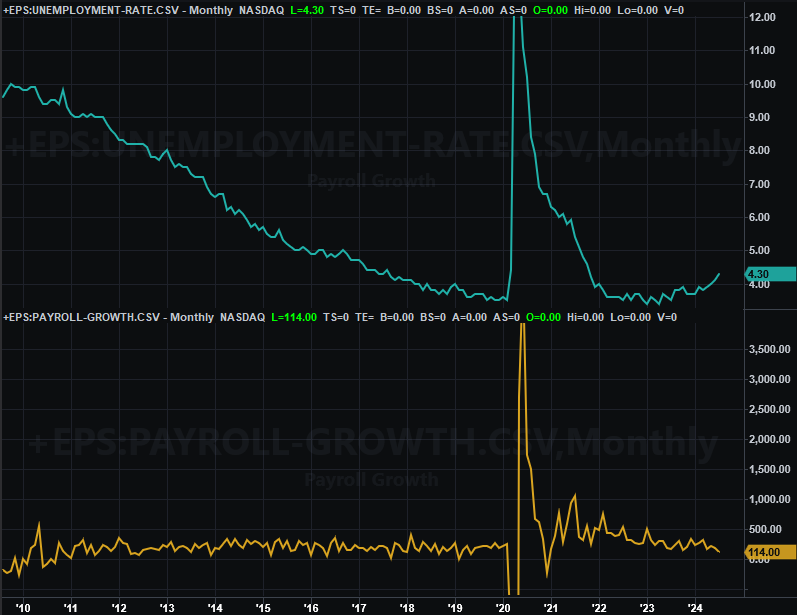
Source: Bureau of Labor Statistics, TradeStation
And this brings us back to something that happened -- or didn’t happen -- on Wednesday. That is, the Federal Reserve didn’t cut rates this month even though it had a scheduled opportunity to do so. Without saying as much the FOMC suggested a one-quarter-point cut was in the cards for September.
In retrospect, July’s jobs figures say the Fed could have imposed a rut cut than and then put another one in place next month. As a result, the market’s now actually betting on a half-point cut in September, thinking the Federal Reserve will want to make up for time lost by not spurring the economy when it arguably should have.
Everything else is on the grid.
Economic Calendar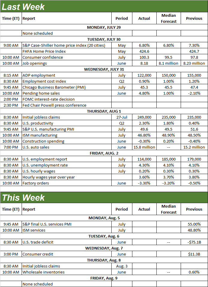
Source: Briefing.com
This week’s actually going to be quite light. The only item of any interest is the aforementioned ISM Services Index figure due on Monday. It’s a much-welcomed reprieve in that this will let the market settle down and figure out its current direction without being pushed around by any major economic news.
Stock Market Index Analysis
Yes, the market suffered its third consecutive week of losses last week, falling under a few more key technical support levels in the process. But, don’t be too quick to jump to bearish conclusions. Friday’s tumble was so harsh that we may well see a dead-cat bounce on Monday once cooler heads are looking at things and recognize traders were a little overzealous with their reactions.
On the other hand, the ease with which stocks were up-ended by news that shouldn’t have been entirely surprising is a worry in and of itself.
We’ll start this week with a look at the daily chart of the NASDAQ Composite. As you can see it broke under a minor support line (yellow, dashed) that had connected the key lows since October, and broke under its 100-day moving average line (gray) at 16,885 as well. That’s bearish. But, it also left behind a pretty big gap on Friday that’s now begging to be filled in.
NASDAQ Composite Daily Chart, with VXN and Volume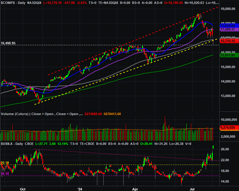
Source: TradeNavigator
Perhaps the most noteworthy detail on the NASDAQ’s daily chart, however, is the NASDAQ’s Volatility Index (VXN). It soared to multi-month highs on Friday, suggesting investors are suddenly very, very worried. It takes a look at the weekly chart of the composite, in fact, to put the VXN’s surge in perspective.
NASDAQ Composite Weekly Chart, with MACD and Volume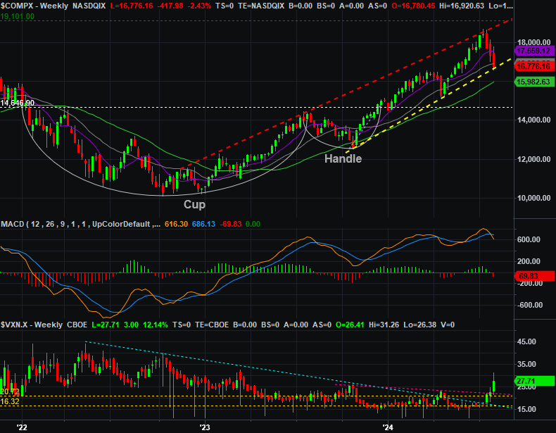
Source: TradeNavigator
The weekly chart also illuminates another important detail. That is, the 10% tumble from July’s peak is roughly the normal-sized correction for the NASDAQ right now.
That’s not to suggest the composite can’t move any lower from here. We do have a fresh MACD crossunder, after all, and it’s not as if the VXN is back to levels seen in 2022 when the market was first trying to make a major bear market low. We’re simply saying if the bulls wanted to make a stand somewhere, this is one spot where they’re likely to do it. Friday’s bearish gap only bolsters this argument.
The daily chart of the S&P 500 looks similar -- but not identical -- to the NASDAQ Composite’s. Namely, it appears to have taken on more water. The 100-day moving average line (gray) stepped up as a technical support area on Friday just as it did in April. But, no other likely floor did so. Note that there was also a lot of volume (and growing volume) as the selling went on, suggesting traders are growing progressively panicked.
S&P 500 Daily Chart, with VIX and Volume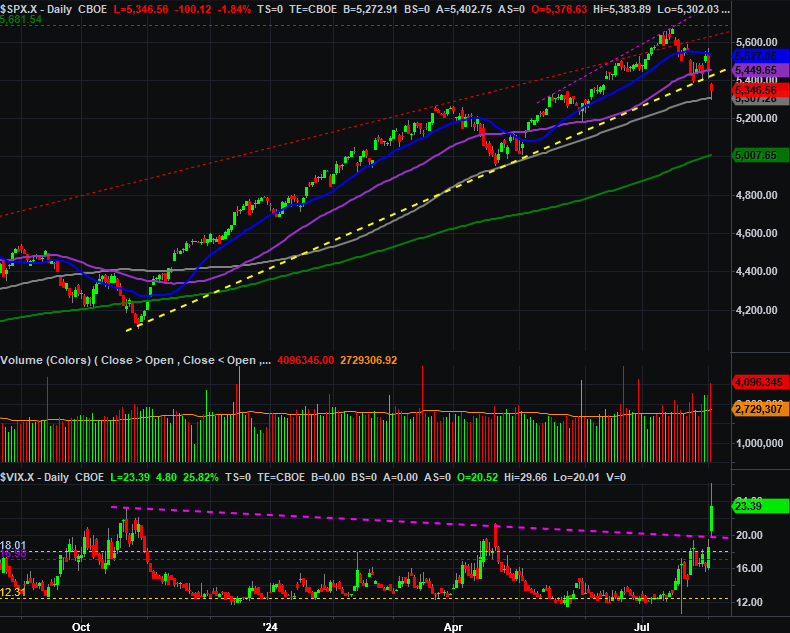
Source: TradeNavigator
The weekly chart doesn’t add much more to the observation.
S&P 500 Weekly Chart, with VIX and MACD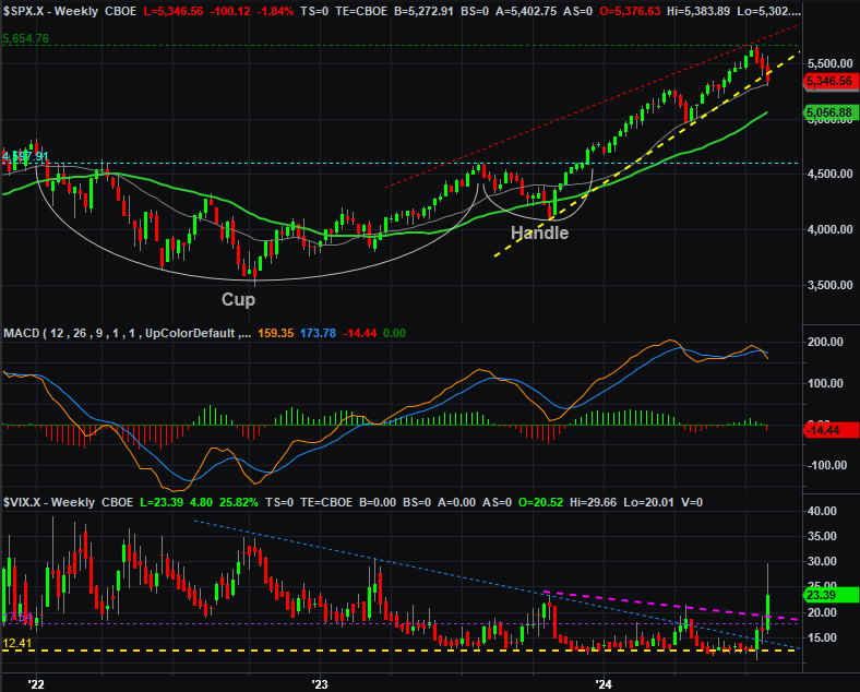
Source: TradeNavigator
So what’s the call? The circumstances are net-bearish. But, this is the least trustworthy bearishness we’ve seen in a while. Friday’s setback wasn’t planned or thought-out. It was a panic, and panic doesn’t always last. Indeed, sometimes the market likes to unwind the impact of panic just on principle. And there’s certainly no denying the selloff over the course of the past three weeks was too much, too fast.
Therefore, the smart-money move here may just be waiting and seeing how the market responds when the new trading week gets going. We’ll likely see a little bit of bullish pushback, but unless that effort carries both indexes back above their 50-day moving average lines (purple) and/or their 20-day line (blue), that effort is ultimately likely to cede to the bigger bearish tide. A break below last week’s lows could really open the selling floodgates. We’ll see.