
The market showed a bit of predictable vulnerability two weeks ago. It clearly showed much more last week, by virtue of the biggest loss in months that snapped some -- though not all -- of the nearest technical support levels. The bearish jolt could spark a more serious wave of selling.
That’s not the most alarming part of last week’s action, however. Something else happened that we’ve not seen in a while that underscores the prospective bearishness. That is, the volatility indexes jumped. They also bumped into some minor technical ceilings, so these surges could already be over. But, it’s a curious red flag all the same.
We’ll look at all of it in some detail in a moment. Let’s first, however, look at last week’s biggest economic reports and preview what’s coming this week.
Economic Data Analysis
Busy week. The party started in earnest on Tuesday with June’s retail sales data. Spending was up (and more than expected) after May’s lull. One good month doesn’t make a trend, but all good trends start with that first good month. If nothing else, at least consumers are doing their part to keep things going.
Retail Sales Charts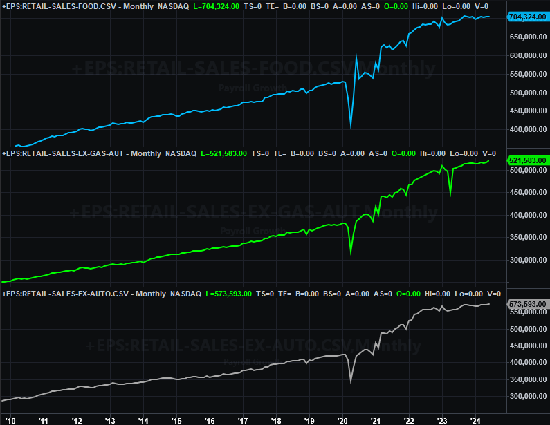
Source: Census Bureau, TradeStation
On Wednesday we got June’s housing starts and building permits. You may recall both have been pretty lousy of late, and downright awful in May. Things perked up a little bit last month, but only little bit. The overall numbers remain uncomfortably low.
Housing Starts, Building Permits Charts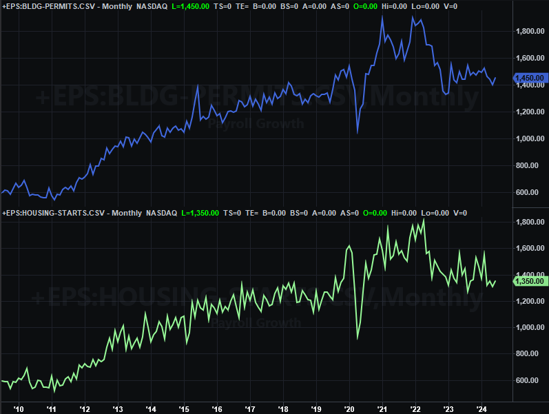
Source: Census Bureau, TradeStation
Finally, also on Wednesday we heard June’s capacity utilization and industrial productivity report from the Federal Reserve. These measures started to improve a couple months back, but jumped quite a bit last month. Productivity, in fact, reached a multi-year high.
Capacity Utilization, Industrial Production Charts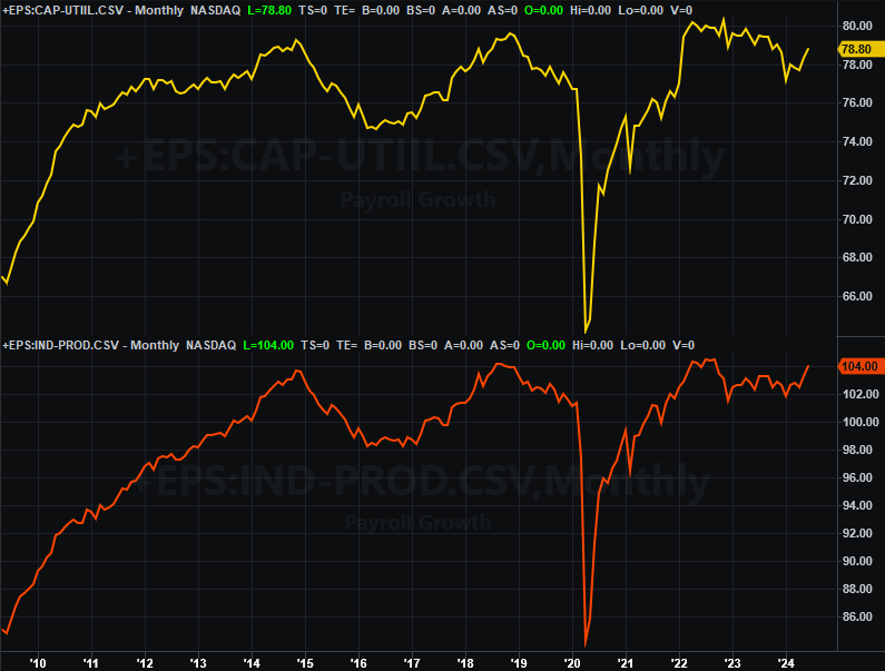
Source: Federal Reserve, TradeStation
This isn’t insignificant. Both of these numbers actually trend with earnings as well as the long-term market. It has no impact on the market’s short-term gyrations, but these budding uptrends do suggest the so-called “soft landing” scenario has already materialized. Stocks should follow suit.
Everything else is on the grid.
Economic Calendar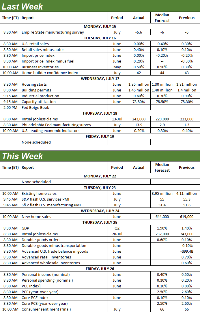
Source: Briefing.com
This week’s dance card is even more full.
It’s a big week for real estate data. June’s existing home sales will be released on Tuesday, while last month’s sales of new homes will be reported on Wednesday. Both have been poor for a while -- and generally getting poorer -- although we’re seeing some degree of recovery effort with existing home sales. Neither are expected to get meaningfully better this time around, affirming that the real estate market remains on the defensive.
New, Existing Home Sales Charts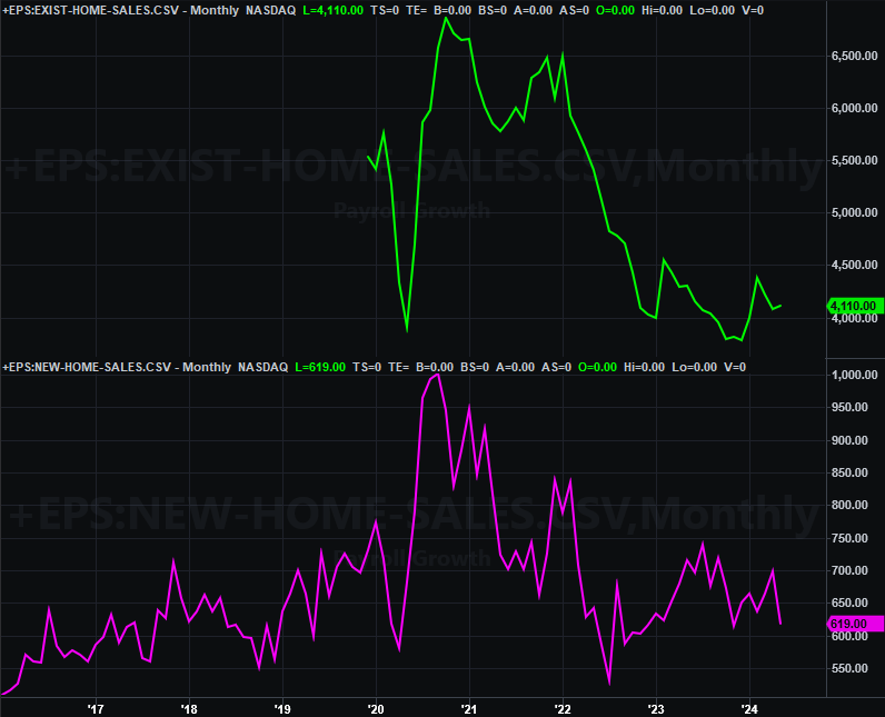
Source: National Assn. of Realtors, Census Bureau, TradeStation
We’re not charting it, but also know that the first estimate of Q2’s GDP growth will be posted on Thursday. Economists are looking for an improvement on Q1’s growth of 1.4% to a pace of 1.9%. That, however, still isn’t exactly thrilling.
On Friday we’ll hear about June’s personal income and consumer spending… measures that largely drive the Fed’s decisions regarding interest rates. This data has actually shown surprising strength of late, postponing the next rate cut. This strength is expected to have persisted through last month.
Finally, also Friday look for the third and final reading of the University of Michigan’s consumer sentiment for July. This figure had been on the mend since the middle of 2022, but forecasts are calling for continued downside since March’s peak.
Consumer Sentiment Charts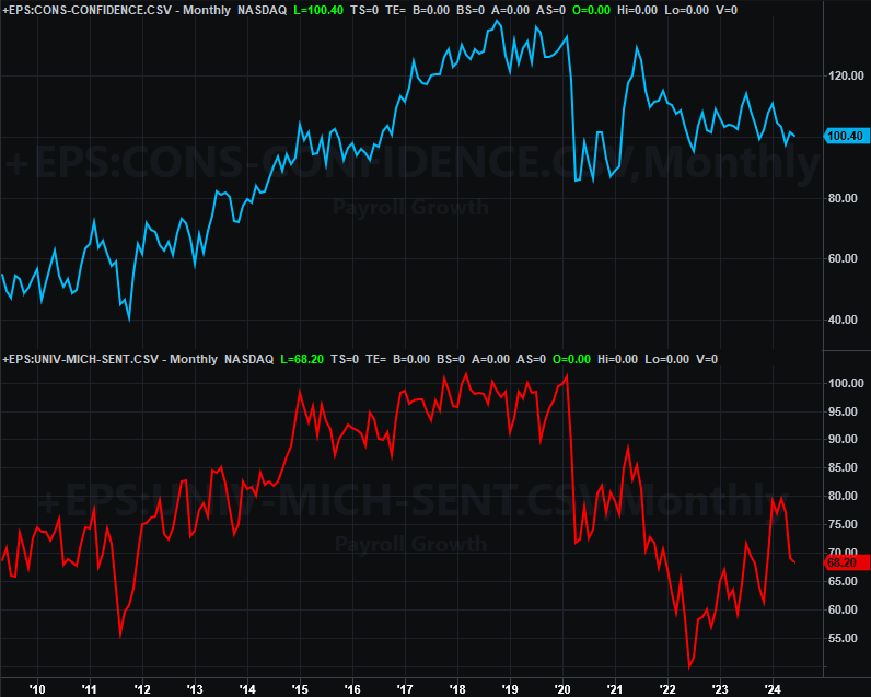
Source: University of Michigan, Conference Board, TradeStation
The Conference Board’s consumer confidence has also been trending lower for some time now. It will be updated next week, but there’s no major change to the current downtrend in the cards.
Stock Market Index Analysis
The bulls have been playing with fire for some time now. Last week, they finally got burned. The S&P 500 fell 2.0%, while the NASDAQ Composite tumbled 3.7%. And that was after a bullish start to the week. From high to low, the S&P 500 actually lost 3.0% last week.
Perhaps more important though, with that sweeping reversal both the NASDAQ and the S&P 500 broke below at least one important technical support line. That’s the 20-day moving average line (blue, on the daily chart of the S&P 500 below). That’s a first step, although the real risk here is that the move spooked the bulls into believing a bigger correction is now a distinct possibility.
S&P 500 Daily Chart, with VIX and Volume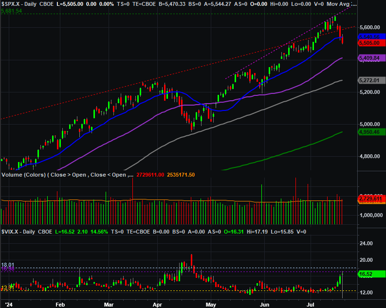
Source: TradeNavigator
Except, that’s not the only noteworthy nuance of last week’s action.
As the daily chart above also shows us, the S&P 500 Volatility Index (VIX) started to soar. This says traders really are growing concerned that things could get worse before getting better again. Also notice, however, that the VIX’s advance stopped at a pretty-well-established horizonal ceiling near 17.0. Its upward thrust may well have ended there. That could bring a quick end to the market’s budding pullback. There’s the rub. The weekly chart of the S&P 500 below puts this action in better perspective.
S&P 500 Weekly Chart, with VIX and MACD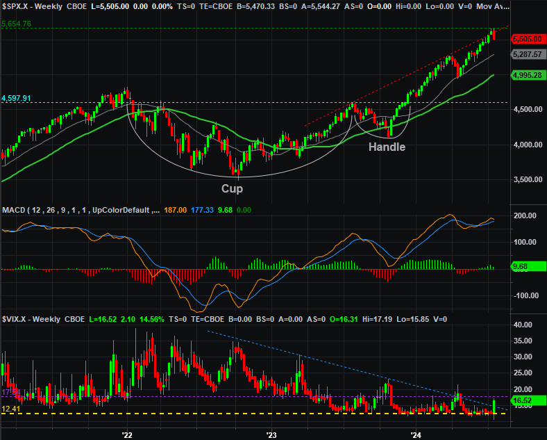
Source: TradeNavigator
The weekly chart of course shows us another potential problem with the not-so-bearish-after-all theory. That is, one rough week just isn’t likely to be enough to burn off the market’s froth that was in place just a week ago. It should take two (or more), like it did in April as well as in autumn of last year. Also bear in mind that last week’s peak took shape right where the cup-and-handle pattern said it would… or at least should. And it’s worth adding that even though the VIX bumped into a technical ceiling, it didn’t come anywhere near the 30+ level that’s tend to be reached when the market makes a major low.
The weekly chart of the NASDAQ Composite tells the same basic story. That is, last week was painful, but not painful enough to call it a good, full-blown correction. The composite would need to slide at least all the way back to the 16,800-ish area to form a major low that sets up a rebound.
NASDAQ Composite Weekly Chart, with MACD and Volume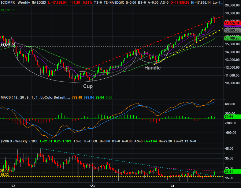
Source: TradeNavigator
The daily chart of the NASDAQ adds some details to this discussion. The 16,800-ish area is where you’ll not only find the 100-day moving average line (gray), but where the line connecting the past couple of key lows (yellow, dashed). You can also see on this chart how the NASDAQ’s Volatility Index (VXN) bumped into a technical ceiling of its own.
NASDAQ Composite Daily Chart, with VXN and Volume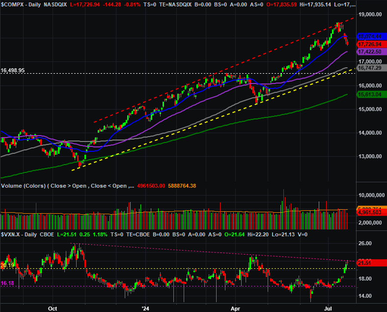
Source: TradeNavigator
The smart-money move to make right now is doing nothing and letting this play out. The extreme nature of last week’s intraweek reversal sets the stage for some bullish pushback, but the bigger path of least resistance is still downward. It’s just not a straight path down. Both of the indices need to slide back to strong technical floors before we can say the weakness we’re due has actually run its full course.