This Is Not Normal: Monday's Action From NASDAQ's Tech Stocks Points to Trouble

If you're impressed by the market's apparent resilience over the course of the past few days - or even the past few weeks - don't be. It's dangerously lopsided, which could portend trouble.
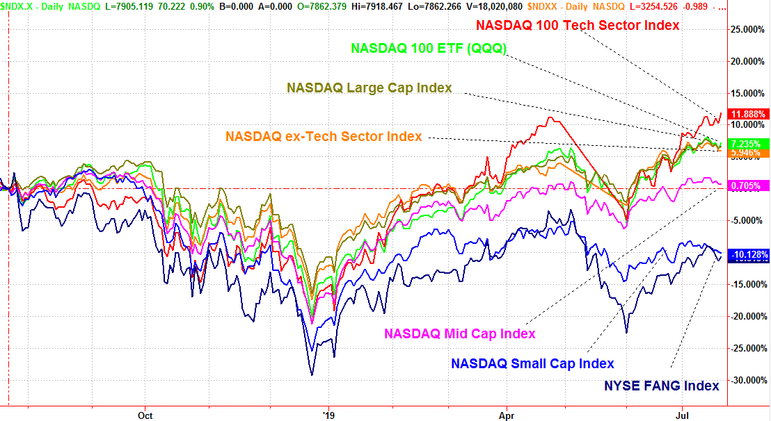
Reality: Were it not for the technology sector, and the NASDAQ's large cap tech stocks in particular, the broad market could easily be in the hole since the end of June. In fact, when taking out FANG stocks and other large cap technology and tech-related names, the market is down for the month so far.
It's not unheard if, but it's problematic all the same. The last time we saw something like this was in April, leading into May's sizeable setback. We saw it through June of last year, right on front of a major selloff.
It's a counterintuitive idea that also defies history.
FANG Stocks as a Safe Haven?
There was a point in time when strong interest in aggressive growth and tech names was a barometer for rampant bullishness, and would have been interpreted as a sign of more gains ahead. Now, however, such a divergence is annoying at best, and dangerous at worst. It suggests that participation in a rally is falling by the wayside, but rather than the usual migration to utilities stocks and consumer staples names that would provide a safe haven, at least to some degree investors are filing into names like Facebook, Alphabet and Amazon as the safe havens.
There's a mostly reasonable logic to it. The market has become uncomfortably top heavy, with the biggest names making up far more than their fair share of the market's total capitalization value. The mega-names like Facebook and Microsoft, and Amazon, do indeed capture a massive amount of the spending corporations as well as consumers are willing to hand over.
It's still a dangerous scenario for the market all the same though. Even the mega caps with their outsized influence over the broad market can't keep the market afloat on their own.
To that end, a couple of other data sets are starting to point to the trouble that isn't readily apparent with just a quick look at the overall market.
NASDAQ Stocks Above, Below 50 and 200 Day Moving Average Lines
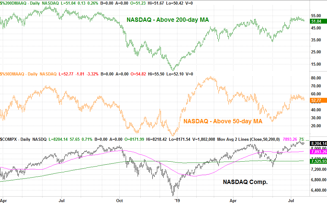
One of those data sets is a comparison of how many of the NASDAQ's stocks are above their 200-day and 50-day moving average lines, and how many aren't. Curiously, though the composite is leaps and bounds above its own 50-day and 200-day moving averages, barely more than half its listings are actually above those marks. Both figures are on pace to fall under the 50/50 midpoint as well.
It's confirmation that small stocks are performing poorly, and/or large names that exert a great deal of influence on the NASDAQ Composite's value are doing more than their fair share of work.
NASDAQ Advancers, Decliners, Up and Down Volume
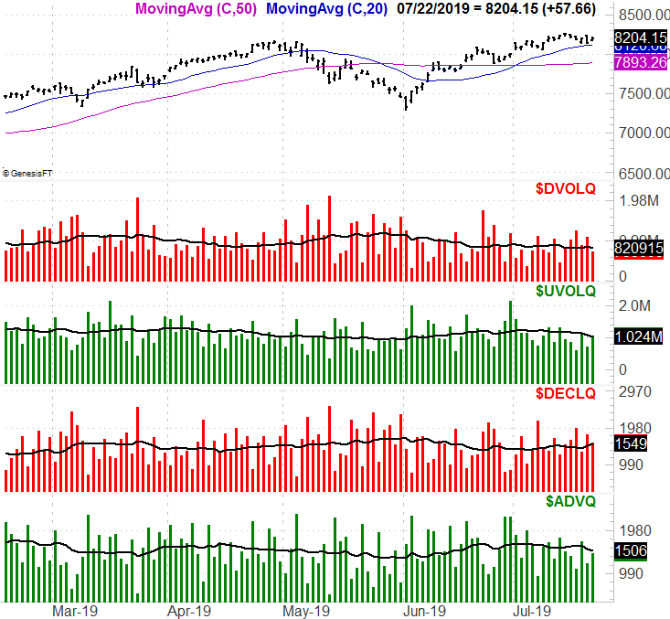
The other data set is partially related... the NASDAQ's up and down volume, and the NASDAQ's advancers versus its decliners.
There was more bullish volume than bearish volume for the NASDAQ exchange on Monday, though not leaps and bounds more. More important is that the daily bullish volume for the NASDAQ continues to shrink. Worse, though the composite rallied on Monday, there were more losers than winners. There were 1586 names that lost ground, and 1460 NASDAQ tickers that lost ground.
Again, it's a clearer picture of the NASDAQ's true health.... or in this case, a lack thereof.
The clues are hardly any sort of guarantee of trouble. There are no guarantees anymore. That fact that investors are gravitating to consumer-oriented tech names as a means of securing safety underscores a dramatic shift in trading psychology. Even more shocking is that sometimes, even if only in the short run, the strategy works.
Sooner or later though, all debts must be paid, and all price aberrations must be rectified. If that's not in the cards for the NASDAQ now, it will be soon enough.
A break under the 20-day moving average line currently at 8121 could be just the trigger needed to start unwinding all of this unusual tension.


