Watch The Wicks - Candlestick Chart Trading
Candlestick Trading: What Do Wicks Tell Us?
by Richard Cox
In recent years, we have also seen an upsurge in the number of people interested in technical price analysis. This has changed the way large percentages of the investment community view their positions. More and more active investors and traders are finding use in Japanese candlestick charts. This is generally because these are the charts that give you the most information at a glance.
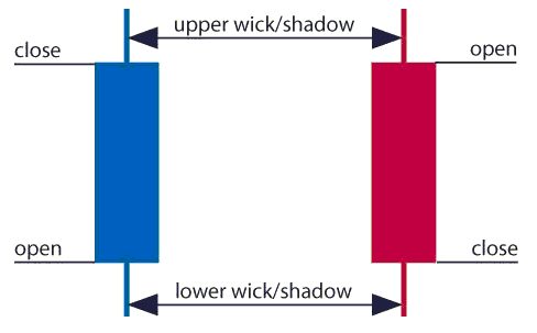
The first graphic shows the basic structure of the bullish and bearish candlestick. Instantly, we can see the open, close, high, and low for each time interval and also determine whether or not the price action during that period was positive or negative. All this information might be much more useful for those with short term trading strategies (ie. after news releases), as these will often require you to make snap decisions with much more volatile conditions in place.
Wicks Marking Extreme Highs and Lows
The basics of candlesticks are easy to grasp but traders often tend to overlook the nuances that are present in the representation of each interval. Candlesticks give us implied information that comes in addition to the simple readings of high, low, opening, and closing prices. Candles are able to give us significant clues about the validity of the underlying trend, the sustainability of momentum, and the general level of sentiment that is present in the market at any given time. Candlestick patterns such as the Doji, for example, can indicate that market trends have reached an exhaustion point and are unlikely to continue. In contrast, a Bullish Engulfing pattern might signal that an uptrend is still running along smoothly and still has the capability to reach new highs.
This is important information that cannot be seen in price charts that show only the opening or closing prices. So, while it would be impossible to go over all the nuances of the candlestick viewpoint in this article, it should suffice to say that we are viewing much more than simply price activity when we are looking at these types of charts. Specifically, we are able to use these tools to assess broader sentiment and the likelihood that prices will be able to continue moving in their present direction.
Supply and Demand
Any approach to technical analysis should first start with the understanding that supply and demand is what governs markets. When an asset starts to fail at a key resistance point, it is an indication that there is too much supply to sustain prices at their current levels. When prices bounce off of a support level, it is an indication that there is too much demand to keep prices low. But most important for our discussion here is that these types of moves tend to happen quickly.
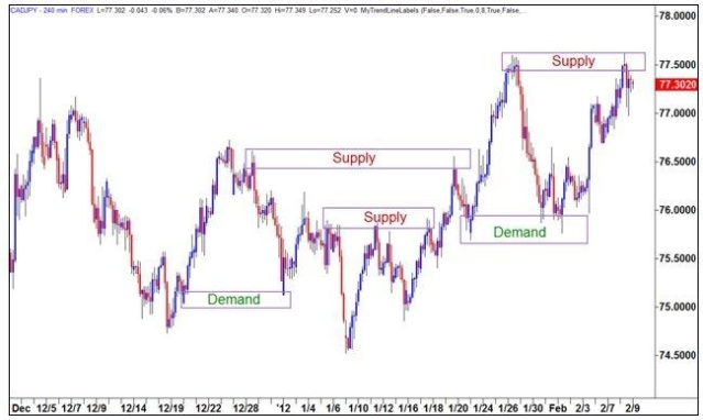
CAD/JPY Supply & Demand Candlestick Chart

In the Canadian Dollar/Japanese Yen (CAD/JPY) chart graphic above, we can see instances where strong supply or demand has started to change the structural trends seen in the market. Failures at resistance and bounces from support are usually seen when prices have made extreme deviations from their historical averages. This is the activity that creates the 'wicks' in candlestick trading. Since these moves tend to happen quickly, prices generally rise or fall too quickly to hold at those levels as the interval is closing. So, wicks essentially show you the market's rejection points -- the points at which the market has decided there is too much supply/demand relative to the current price level.
Trend Characteristics
Another point to remember is that trends themselves have their own 'trends.' That is to say, there are common characteristics that be identified in the majority of the market's trending moves. Momentum builds to a peak and then reaches an exhaustion point. The exhaustion point is the end of each wick, and candlesticks can help us to quickly visualize the present stage of the current trend moves you are watching. When a wick forms on one of the longer term time frames (ie. the weekly or monthly charts) it is a strong indication that sentiment has turned, and this is often an early sign of trend reversal. Traders that are able to identify these events as they occur will then have the opportunity to 'buy low, and sell high.'
In most cases, this is where the best opportunities for low-risk entry points can be found. This is one of the best strengths of technical analysis as traders well-positioned with an understanding of these concepts are usually able to spot changes in market supply and demand much more quickly than the traders that are relying on a fundamental basis for their trading ideas.
Validating Support Turned Resistance
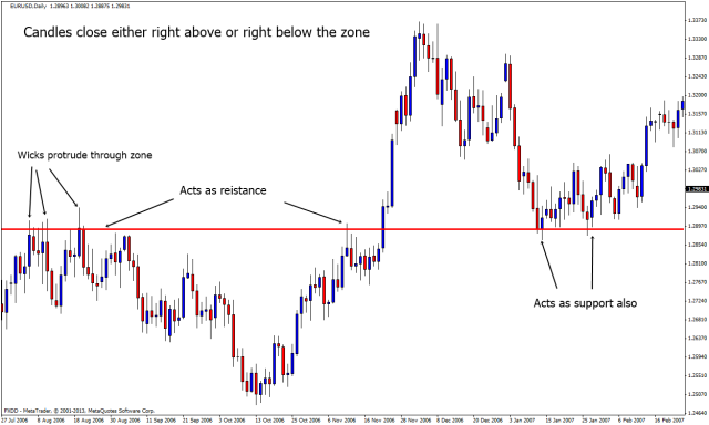
EUR/USD Support/Resistance Candlestick Chart

Additionally, candle wicks can be used to validate situations where support is turned to resistance, and resistance is turned into support. In many cases, support will start to act as resistance (and vice versa) once the level is overcome and it is highly common to see wick develop when these market events occur. It is also common to see 'blow-off' tops and bottoms where the wicks will briefly pierce a support or resistance level -- only to quickly reverse and catch traders in a false breakout scenario. These events can be costly, to say the least. So here, candle wicks can actually give us an indication of what NOT to do (ie. buy or sell a breakout if we do not see the time interval close above or below the support/resistance level you are watching.
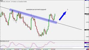
In the second support/resistance chart below, we can see how these events might unfold when trend lines are used as the support and resistance zones. These situations might look different than range scenarios with horizontal lines of support and resistance -- but the rules for each situation remain relatively similar.
Trendline Resistance Now Breakout Support Chart

Conclusion: Watch For Wicks Before Making Trade Entry Decisions
It can be easy to dismiss candle wicks as an irrelevant part of the trading equation and focus instead on the price action seen in body of the chart candle. Some might argue that this is the most important (and relevant) area to watch because this is where prices are stuck most of the time. But while the candle body might be a better indication of the true price of an asset, this is not going to be where the best trading opportunities rest as most of the extreme moves have already been seen once prices revert back to these areas. Trade entries that are based on candle wicks have the potential to include much better risk-to-reward scenarios as they deviate from the 'true' price of the asset.
So, when we look at wicks, it is important to start positioning for possible reversals as sentiment starts to change with respect to the broader trend. Conversely, wicks can also be used as a means for validating support turned resistance levels . Activity here can actually be used to show that a bullish or bearish trend is still in place so there are many different ways to view what is happening in the markets when price wicks occur. because of this, it is always a good idea to look at chart formations in the context of the broader market rather than looking at them in isolation. Nothing in trading happens in a vacuum, but price wicks give traders a lot of important information that is often overlooked by people that are not closely watching their charts. Avoid these mistakes, and you will be in the position to make higher probability strategies for entering into your positions.
Courtesy of traderslaboratory.com

