Grinding 2015 Market Is Similar To 2011 By This Measure
Grinding 2015 Market Is Similar To 2011 By This Measure
Rising volatility suggests a repeat of 2011 for S&P
By one measure, 2015 S&P 500 volatility is the highest since the beginning of this bull market.
There are various ways to measure stock market volatility. The CBOE Volatility Index (VIX) (VXX) is one of them. A VIX reading of 15.39 (Monday's close) implies a 15.39% S&P 500 (SPX) (SPY) move (up or down) over the next 12 months, or 4.44% over the next 30 days.
But there's a difference between implied VIX volatility and real volatility (as in actual stock market swings).
'Real' volatility
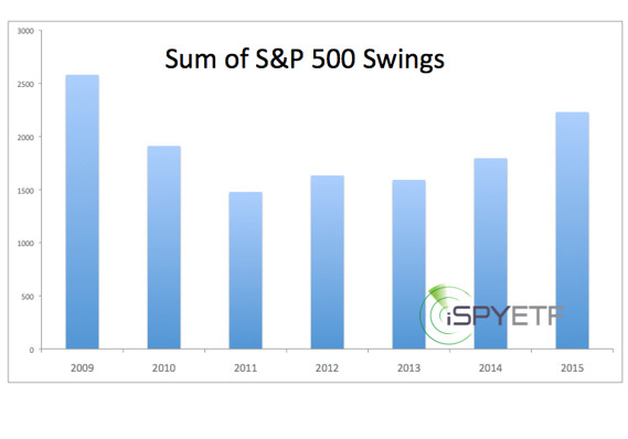
Since the beginning of the year (111 trading days as of June 12), the S&P 500 has moved a total of 2,230.97 points (sum of swings from daily high to low). Thus far, 2015 been the most volatile year since this bull market started in March of 2009. Keep in mind that 2009 saw a violent drop into the March 6 low at 666, and vigorous rally gains thereafter.
What does the S&P 500 have to show for all this volatility?
A meager 35-point or 1.71% year-to-date gain. This volatility within a tight range and little net change is like a bouncing kangaroo on a treadmill.
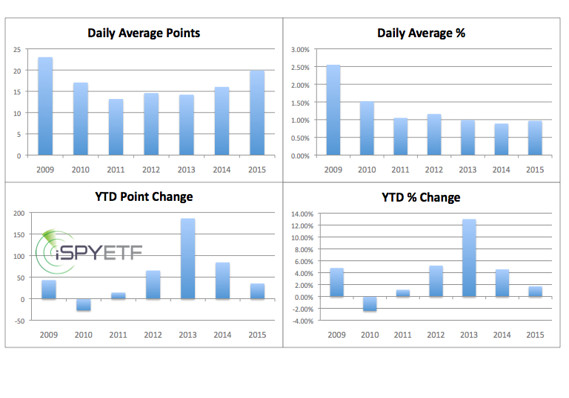
Other measures of volatility are illustrated by the chart below.
* Daily point change (point difference between high and low)
* Daily percentage change (percentage change between high and low)
* Year-to-date net point change
* Year-to-date net percentage change
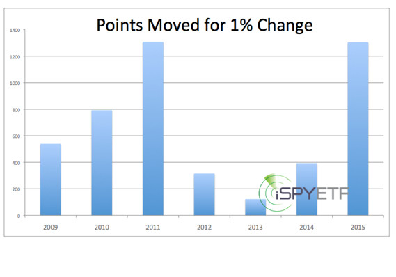
Perhaps no other chart captures investor frustration better than this one. It shows how many points the S&P had to move for each percent of net gain.
What's the Lesson?
In terms of spinning wheels and wasting energy only 2011 was worse than 2015 has been.
The S&P was essentially flat after the first 111 tumultuous trading days of 2011. Interestingly, 2011 was not only flat after the first six months, it was also flat after the full year. However, and that's where it gets interesting, sandwiched between a boring beginning and a boring end was a 20% not so boring summer meltdown.
Could 2015 follow the same format as 2011?
Obviously, every year is different, but there are a couple of commonalities worth noting:
* Both 2011 and 2015 are pre-election years
* The S&P 500 showed signs of internal deterioration before the 20% July/August meltdown
Similarly to 2011, the S&P 500 is again showing clear signs of internal deterioration.
Courtesy of marketwatch.com