Weekly Market Outlook - Can't Shake the Coronavirus Bug
The tepid bullish start to last week ended downright bearishly, with Friday's decided stumble even worse than Thursday's setback. Lingering coronavirus got the bulk of the blame, and (probably) rightfully so. But, it wasn't a terribly tall order to tip stocks over. They were already overextended.
Yet, as rough as things were as the week wound down, the broad uptrend's floor has yet to be broken. It's pressured, but not broken. The backdrop looks bad though, as we're starting to see red flags -- again -- that we didn't see with previous stumbles.
We'll explain in detail below, right after a rundown of last week's economic news and a preview of this week's announcements.
Economic Data Analysis
Not a terribly busy week last week in terms of economic news, but the Federal Reserve did give us something noteworthy. Although not a meeting scheduled to implement a rate change or hold interest rates steady, the FOMC did indicate in the minutes from its last meeting that it's happy with where interest rates are here. The economy is neither too hot nor too cool, but in that middle range that can be sustained indefinitely.
That being said, there were a couple of quantified pieces of information worth a look. One of them is last month's producer inflation pace. The other is January's housing starts and building permits.
You may recall that in December, housing starts jumped to 1.62 million (annualized)... a multi-year peak that may have had something to do with the calendar. Permits didn't rise nearly as much, but both readings were still strong. Last month, starts ebbed a little, but are still at incredible highs. And, for some reason, permits swelled to 1.55 million, suggesting starts should be strong in the coming couple of months.
Housing Starts, Building Permits Charts
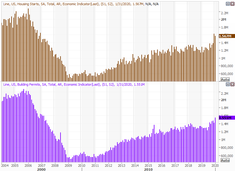
Source: Thomson Reuters Eikon
On balance, the data says that at least the housing and construction piece of the market is doing well, and indicates consumers are doing well too.
Interestingly, while the Fed is content with where things stand, we actually did see our first glimpse of inflation. Overall prices for producers -- factories, assembly plants, etc. -- grew 0.5% from December's levels. That said, don't read too much into the report. It was being compared to a fairly tepid period a month ago. The annualized inflation rate for producers stands at a palatable 2.6%, which is a little more than the Fed would like, but not devastating.
Consumer, Producer Inflation Charts
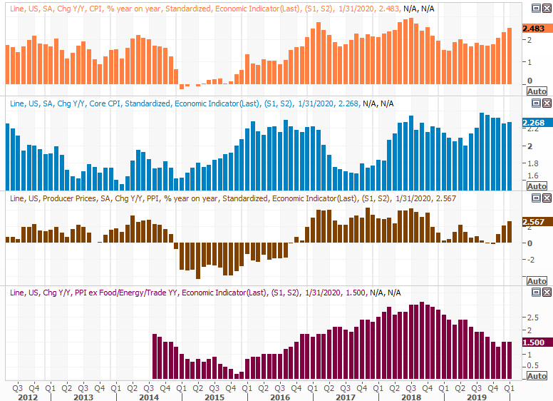
Source: Thomson Reuters Eikon
Everything else is on the grid.
Economic Calendar
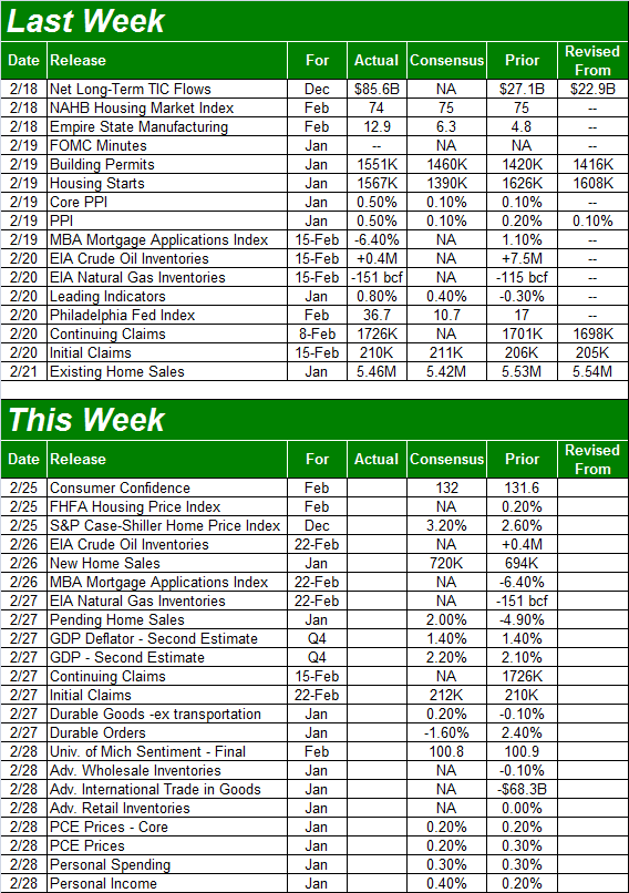
Source: Briefing.com
This week's got a lot in store, but not a great deal of it is hard-hitting. In fact, there's only a trio of things we'll make a point of noting.
The first of those three is February's consumer confidence reading, as measured by the Conference Board. Economists are looking for a slight lift in the already strong level. As was noted above, consumers are feeling good, and spending accordingly.
Consumer Confidence Charts
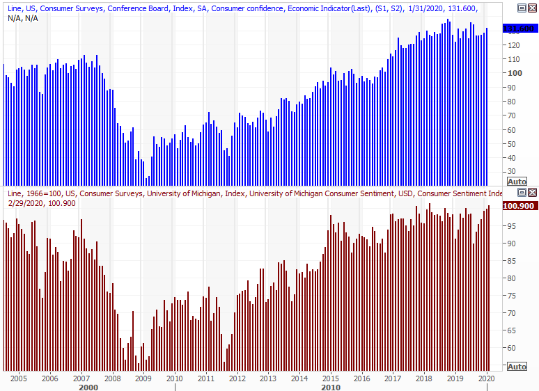
Source: Thomson Reuters Eikon
We're also going to hear about home prices, with the FHFA's measure as well as Standard & Poor's look due on Tuesday. The pros are not only calling for more progress, but accelerated price growth that jibes with starts and home-buying activity, both of which are firm.
Home Price Charts
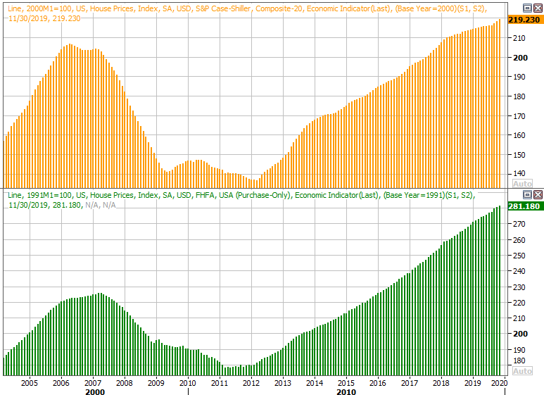
Source: Thomson Reuters Eikon
Lastly, on Wednesday look for January's new home sales report. All indications are it should be a healthy one, given starts, permits, and pricing data. Also remember sales of existing homes are strong, even if not soaring.
New, Existing Home Sales Charts
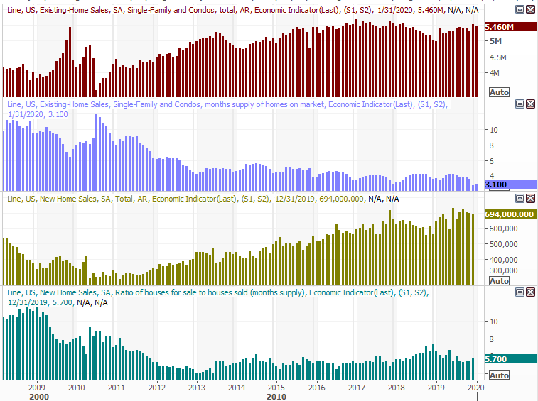
Source: Thomson Reuters Eikon
Stock Market Index Analysis
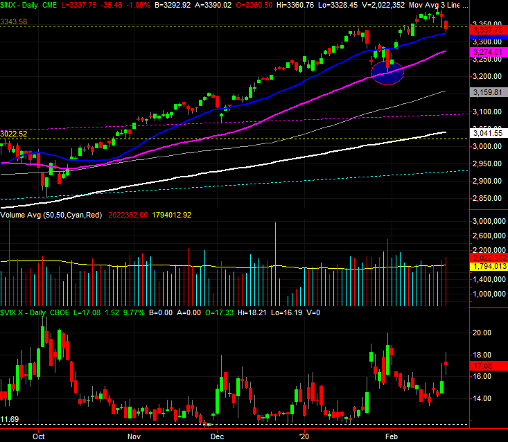
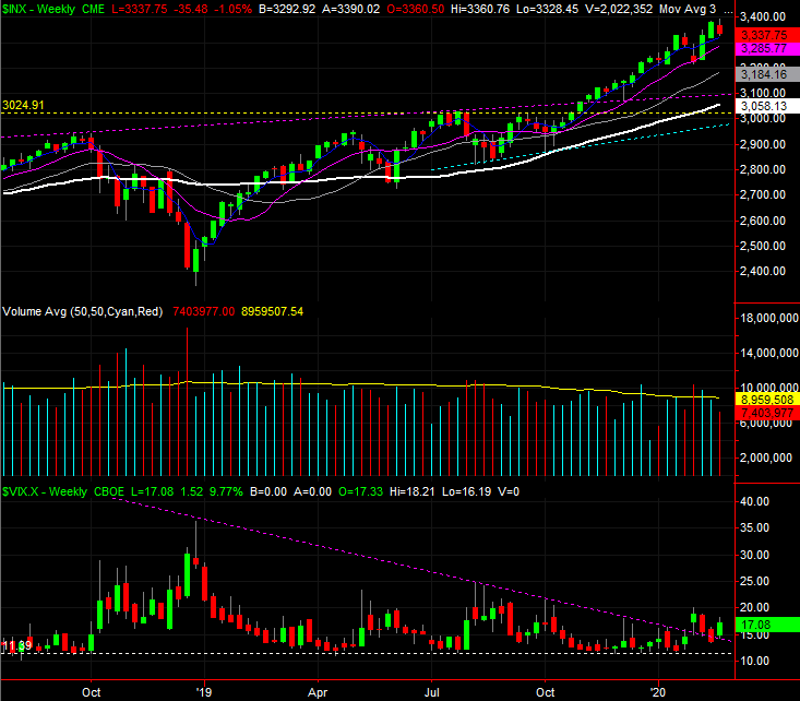
We'll start this week's analysis out with the very most important, and troubling, chart... the daily chart of the S&P 500. On this graph we can see the full scope of the selloff. The index struggled for days to move higher, but when that clearly wasn't going to happen, it didn't take much to pull the rug out from underneath the market. Also notice how much volume surfaced with Thursday's and Friday's selloff. It's alarming because it didn't surge. Rather, volume just drifted higher, suggesting it wasn't knee-jerk, panic selling.
S&P 500 Daily Chart, with VIX and Volume
Source: TradeStation
It's not necessarily the end of the world. Notice that while the S&P 500 lost 1.2% of its value last week, it's not yet fallen below its 20-day moving average line (blue). Until that floor breaks, we can chalk up last week's weakness to just a little volatility. Also notice that even if the 20-day moving average line breaks, the 50-day moving average line (purple) is serving as a technical floor. The rally since October has been incredible, leaving behind lots of wiggle room. Don't jump to any conclusions here.
Still, it would be naive to ignore the prospects for a bigger selloff, particularly given what becomes evident with a look at the weekly chart. Take a look. Specifically, take a look at the fact that the VIX has pushed its way back above the falling resistance line that's guided it lower for well over a year now. Also notice just how far the S&P 500 itself has climbed since the December-2018 low. It's ripe for a correction, and the VIX is slowly but surely hinting at a change in the market's underpinnings. Investors are starting to think a little more defensively, which means they may start to act defensively -- by selling stocks -- in the near future. They just need a little more of a nudge than they've gotten thus far.
S&P 500 Weekly Chart, with VIX and Volume
Source: TradeStation
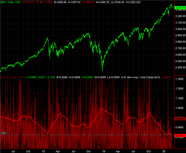
There's a reason we're looking for more fundamental changes in the way traders are thinking too... and it's not the market's fundamentals. It's the psychology traders are presently demonstrating. Between October and early this month, traders didn't bat an eye at clear risks. That optimism carried stocks to record highs, but investors may have gotten a bit arrogant, and are now starting to see the danger of their follow.
There's a way to quantify that qualitative assessment. The marketwide put/call ratio indicates the bets and hedges the so-called "smart money" and sophisticated traders are making. Thing is, they're not as smart as they think they are. When the put/call ratio reaches a level that's unusually low, it's often a sign that the market is peaking and setting up for a sizeable correction.
The image below compares the S&P 500 to the put/call ratio... a ratio that ran into multi-year lows again this month. The moving average line that plots the trend of the daily put/call data hit 0.73 as of Friday. Notice that corrections have taken shape after the put/call measure has fallen to higher levels than that. But, even so, the low put/call reading of around 0.73 in early 2018 led to a sizable stumble.
S&P 500 Daily Chart, with Put/Call Ratio and Trend
Source: TradeStation
It's just a possibility, mind you, but a possibility that aligns with the other red flags waving at this time. The 40% gain from the December-2018 low was plenty of fun, but not quite merited. Ditto for the 17% advance just since October's low.
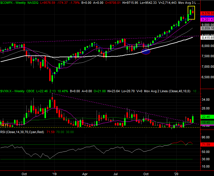
The chart of the NASDAQ illustrates the same vulnerabilities, by the way, and perhaps even more so than the S&P 500's does. Namely, the NASDAQ's volatility index (VXN) closed at its highest weekly close since the third quarter of last year. And, the NASDAQ Composite itself dished out a combination of an "inside day" reversal bar last week that also looks like a shooting star or "tweezers." In more familiar terms, they appear to be an upside down hammer, which often indicate pivot points.
NASDAQ Composite Weekly Chart, with VXN and Volume
Source: TradeStation
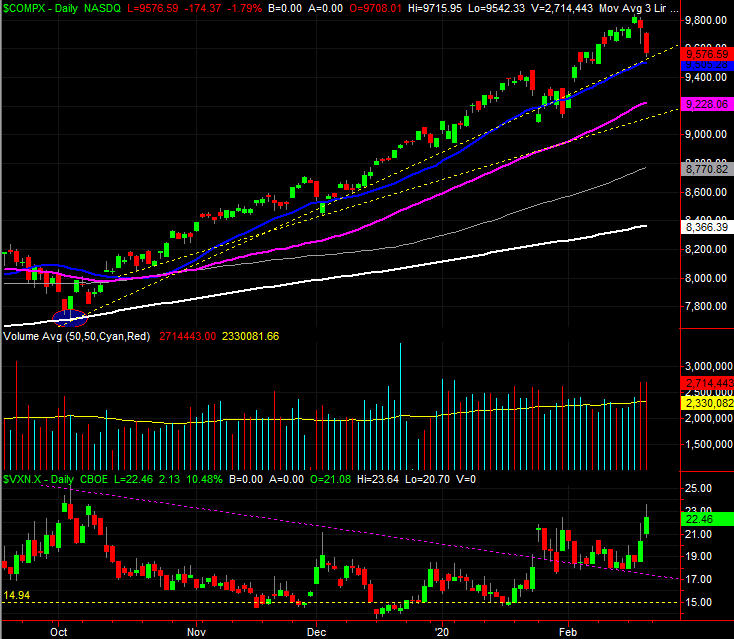
Still, the NASDAQ has the same thing going on the S&P 500 does. That is, the daily chart of the NASDAQ Composite is still finding technical support at its 20-day moving average line (blue). Until it fails to hold up as support, we can't assume anything. In fact, the NASDAQ has a couple of major floors that could stop a selloff just under the 20-day moving average line as well.
NASDAQ Composite Daily Chart, with VXN and Volume
Source: TradeStation
This week is going to be big one for the market, as it faces its first real test in a while. Just bear in mind stocks could push up and off their collective 20-day moving average lines just a bit before starting the blow that breaks support. Don't jump to conclusions too quickly.